• REGISTRATION REQUIREMENTS:

    Your username here MUST MATCH your XenForo username (connected to your XF license).

    Once you have registered here, then you need to start a conversation at xenforo.com w/Bob and provide the following:
    1. Your XenForo License Validation Token
    2. The Domain Name associated with the License
    NOTE: Your account will be validated once ALL requirements are verified/met. Thank you for your patience.

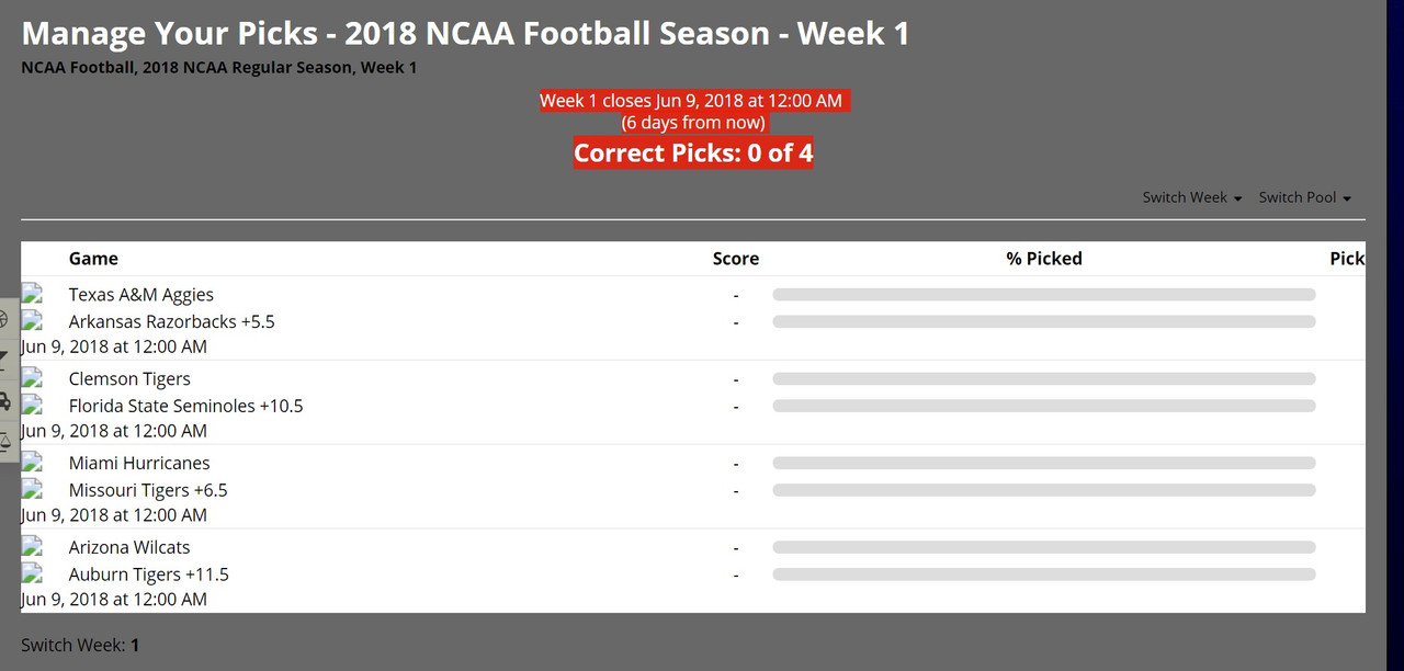
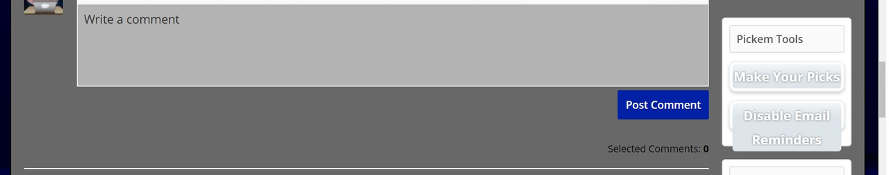
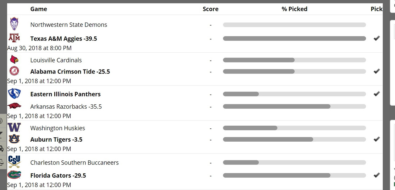
[Pickem 1.x] CSS and logos Issue

oxrageous

New Member
Pick'em
Sportsbook
I set everything up, threw in some dummy games, and tried to make picks. All helmets have been uploaded as well. I get this screen:

pickem.jpg


No helmets loaded, text cut off, and no way to make any picks that I can see. Any help would be appreciated.
 
Make sure that you upload the logo images into all of your custom STYLE's that you are using as well (as each custom style has its own image paths). You most likely have only uploaded them to the default XenForo style.

As for editing picks, there should be a "Make Your Picks" button displayed in the upper right (to the right of the breadcrumbs). I can't tell by your screenshot if the breadcrumbs are displaying or not (if they are not, that would explain why you can't see the button as I am using the xenforo xen:topctrl to add the button to that area and removing breadcrumbs includes removing any buttons that are being added to that area).

Switch to the default style to see if you can see the "Make Your Picks" button on the Manage Your Picks page. Should look like the screen shot below.

Selection_823.png

Also, on the main pool pages, check to see if you can see BOTH of the "Make Your Picks" buttons (one in the breadcrumb area and one in the sidebar).

Selection_824.png
 
You can edit the template: nflj_pickem_main.css and change the following 2 classes to use a different color than green for the 2 status blocks. Note: the status blocks use other colors as well (red, muted, dimmed) as the colors mean something.

This one effects the "Your Score" status block
HTML:
    .statusblock .yourscore
    {
        padding: 0;
        text-align: center;
        color: green;
        font-size: 14pt;
        font-weight:bold;
    }

This one effects the current week status when the week is active (picks can be made) and the pool is OPEN (if the pool is closed, a red status message will be displayed).
HTML:
    .statusblock .active,
    .statusblock .open
    {
        color: green;
    }

NOTE: There are other classes with different colors involved. Green signifies that the week is Active and Open, were as Red means the week is Closed and Grey means that the pool is final.
 
Pickem uses variations of GREEN, RED and MUTED colors throughout the addon to signify specific meanings. You should go through each of the CSS files listed below so that you can change all instances of those use cases (there are several).

Example:

In the template that you've already edited, if you look further down in the template, you will see these 3 classes. They control the bar colors for the Pick Distribution which is used in both the sidebar blocks and for the manage your picks pages.

HTML:
.pdBarGraph.win
{
    background: #5EAC39;
}

.pdBarGraph.muted
{
    background: #969696;
}

.pdBarGraph.loss
{
    background: #d70b00;
}

CSS templates for pickem that contain various classes with Green,Red and Muted font and background colors:

nflj_pickem_leaderboard_player_picks.css
nflj_pickem_main.css
nflj_pickem_picks.css
nflj_pickem_pools.css
 
Thanks for all your help, Bob. I have 2 more styling questions:

My sidebar is kept narrow (160 px) and the notifications block looks like this as a result. Can the height be adjusted so it looks right? I'd also like to change the colors inside the buttons.

pick1.jpg


Secondly, the overall picks page could use some adjusting. There's no padding on either side - both the logos are right up against the edge on the left and the work "Pick" is right up against the edge on the right. Can those be pulled in a little? There's a ton of wasted space between the team names and the score, and the times underneath each game I'd also like to move over in line with the team names.

pick2.jpg
 
If you are going to force the sidebar to such a small size, then I would suggest editing the template and removing the BUTTONS and replacing them with text links. It will look so much better.

As for the Manage your picks, you can remove the padding-left:0 that is being set on those TDs for the Team Icons and the TD for the game info date. You can also remove the padding-right :0 on the TD for the Pick row. This is what it will look like for your style if you do that. Inspecting the elements will tell you the CSS CLASSES that are involved. You will then simply add those classes to Extra.css

Example (this will add a 10px padding-left to the logos that are being forced to a 0px padding-left:
HTML:
.picks tr.dataRow td.logo {

    padding-left: 10px IMPORTANT;
}

You should be able to figure out the others on your own.

NOTE: You can safely edit the CSS directly if you want to as I have no plans to ever change any CSS for XF1 addons. My focus (like everyone else) is on XF2.

Selection_998.png
 
Back
Top